
Paper Route - Team 5 Project 1
A downloadable game
Game Summary:
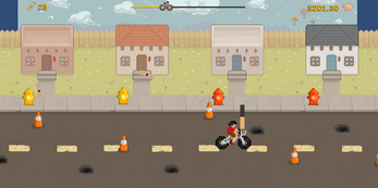
In this retro, arcade-style side scroller, you play a newspaper delivery expert who's trying to make enough money to afford the latest video game cartridge, dubiously titled: Paper Route.
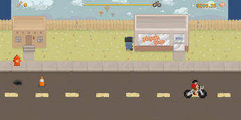
The game is set in the fictional "Land of Enchantment", where you spend your days avoiding potholes and construction cones on the perpetually under-construction roads, attempting to make the most possible money by landing the papers just right (tips, anyone?).
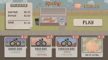
There is continual temptation to purchase a new, fancier bike, in order to turn a higher profit through higher efficiency, but beware, that money has to come from somewhere. Will you be able to afford the Paper Route game cartridge by the time Winter ends?
Fate is in your hands,
Join the paper chase....
Paper Route is designed and developed as part of the UNM Spring 2023 Advanced Game Development Course by Team 5 (Andrew V., Gale S., and Christopher D.). Project is developed and built using Unity.
***Note about Mac version: If you get a security issue opening the Mac version, right click on the application and select "Open" and then "Open" again and it should launch.***
Playtest Information:
A playtest of the game Paper Route, a casual 2D arcade-style paper delivery side-scroller.
Focus Questions for the Playtest:
Here are a few of the questions we're looking to answer with this playtest:
1. How challenging was the game? What would make it more or less challenging?
2. What was the gameplay experience like?
3. How do the user interface and controls feel?
4. What did you like about the game?
5. What did you dislike about the game?
Please feel free to add in additional comments on the playtest, aside from the ones listed, that you think may be helpful or valuable as well.
Try things out, lose the game a few times, see what happens in different situations. Break the game, if you can, and let us know how :)
Thank you for your feedback, and we hope you enjoy playing our game!
GLHF,
Team 5
| Status | Released |
| Author | Christopher DeBonis |
| Tags | 2D, Arcade, Side Scroller, Unity |
Comments
Log in with itch.io to leave a comment.
1. The game was a bit challenging, I think it would be better if you added a system where you can't spam newspapers constantly as that made it too easy and have different obstacles that would cover bigger areas
2. The gameplay was fun but I feel it gets repetitive to fast and can get a bit dull if played for a while, a good fix would be by adding unique obstacles maybe adding a fence to some houses to block newspapers unless you throw it in a special way or limiting the amount of newspapers you can throw to make it more challenging and add skill, customization can also fix some issues and make the game more fun
3. I used my pc and the controls work fine the ui is nice although I found it kinda hard to see the health bar and the money earned so maybe it could be made slightly bigger. I also think it would be nice if I could get an indication of some kind to see how big the hit box of the character is since there were times I was sure I was safe but I still got hit, it's not necessary but I think it could be a bit helpful.
4. The art style is one of the things I really love about the game makes it look charming and attractive to the eye.
5. I didn't like how repetitive the game can be after a while needs more variety of stuff to make it more fun the more you play
Something I found out is that if you go back, the character goes off screen and if you press up while off screen and go forward you end up in front of the houses making it easy to get 25 cents and you could also end up riding on the sky. I couldn't find a way to go back to the ground as the character would get lost off screen and I had to restart.
1. How challenging was the game? What would make it more or less challenging?
Honestly the challenge was good. There were a lot of obstacles but I didnt feel that they were ever too much. It took a bit to get the paper throwing down while dodging but it was pretty smooth I liked it.
2. What was the gameplay experience like?
Gameplay was fun I tried a few times to get a high score I dont think I beat like 2$ but I liked it a lot. Like i said it took a few tries to get used to but by the end I was enjoying making weird paper shots.
3. How do the user interface and controls feel?
it felt a little slow at times but it wasn't that bd except moving backward was a little challenging I know it scales as the bike gets more damaged but it really slows down but that's pretty minor honestly. Outside of that, it felt pretty good.
4. What did you like about the game?
Loved the visuals and the concept. The money system was pretty cool for making different amounts depending on where you threw it. the zia symbol balloon was very epic. Honestly, it was a lot of fun, as a standalone little game very cool. It reminded me of like the little arcade games in Stardew Valley that you can play.
5. What did you dislike about the game?
While the challenge of the obstacles was good I think they did make the screen feel a little cluttered at times but that also wasn't a big deal just something minor that I noticed
1. How challenging was the game? What would make it more or less challenging?
It takes time to get used too to really make sure that you are dodging the obstacles enough while also throwing the papers at the right strength but after a bit you can kind of figure it out pretty nicely. The obstacles were a good idea to give a challenge to the game
2. What was the gameplay experience like?
I enjoyed the gameplay a lot, it was very aesthetically nice and everything fit very nicely together. The only thing I noticed is that the obstacles would clump together quite often at points but otherwise I enjoyed it
3. How do the user interface and controls feel?
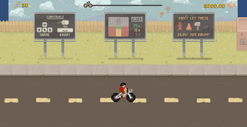
Controls were very nice and easy to understand. User interface was also very easy to understand and the tutorial boards at the start were a nice touch to know what you were getting into in the game.
4. What did you like about the game?
Art style was my favorite of it all. I liked the challenge of trying to get to the 25 cent section of the house.
5. What did you dislike about the game?
I wouldn't say I disliked it more of a suggestion that The flow of the game felt the same the whole time of the game, maybe just adding a factor of it speeding up as you keep going would be a nice way to keep it fresh and add an additional challenge the longer you survive without crashing.
How challenging was the game? What would make it more or less challenging?
I think the game has a mix of casual enjoyment and mild chaos of accumulating cones and potholes. The game interestingly utilizes the choice that a player has to make between getting more money with risk or get less but focus more on getting around obstacles.
What was the gameplay experience like?
The art and aesthetic are phenomenal. It sort of reminds me of Stardew Valley with its more relaxing ambience and objective. It certainly was a challenge at some points, as I would focus so much on aiming properly that I'd keep running into obstacles.
How do the user interface and controls feel?
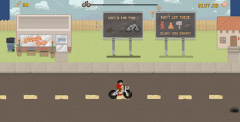
The application of billboards showing controls is a great detail to get straight into the game without complications. The user interface isn't complicated at all. I would say due to these points, it was easy for me to integrate into the controls and general idea of the interface.
What did you like about the game?
The change in season was very neat attention to detail and brought an immersion to the world we're in. I think it would also be fitting if the character also changed clothing to fit the season as a nice touch.
What did you dislike about the game?
This is most likely due to not implementing it yet, but I never noticed when I hit an obstacle. I would focus entirely on aiming without getting a cue that I should also be dodging obstacles.
Overall, fantastic work and can't wait to see how it develops. :)
1. How challenging was the game? What would make it more or less challenging?
The game was pretty straightforward. I think I would rate it a middle of the pack 3/5 challenging.
2. What was the gameplay experience like?
The gameplay was cool, I think I was getting confused on the shooting bar and whether or not green is the correct amount of power because everytime I hit green, the newspaper never fall in the right place where I thought it would be
3. How do the user interface and controls feel?
The user interface is super cool. the graphics are amazing and I like the instructions in the beginning. The controls respond the way I want it to.
4. What did you like about the game?
The graphics is amazing and I like how chill the gameplay is. It was very calming. Good job!
5. What did you dislike about the game?
Mainly what I metioned in 2 but that could be a me problem.
Overall I am excited to see the final product of this game!
I love the graphics for this game, truly beautiful. The small details are there, like the balloons in the background, love it. I love the mechanics, but I feel the road was a little crowded with cones and holes, but you made the hitboxes pretty well that I can squeeze past them.
My suggestion would be to add some effect letting the player know they hit an obstacle.
I'm excited to see what other features you guys might add. For example, the dog chasing the biker as mentioned in class. I'm also curious about how you're going to implement the currency system, what to buy with it, and such. I also think there should be other events that happen in the game, like maybe if you throw a paper near the sidewalk, an NPC comes out of the house to throw the paper at you. Great job!
1. How challenging was the game? What would make it more or less challenging?
I thought it was challenging right at first but once you get the hang of the controls and where to hit to get the newspaper on the doorstep consistently it gets incredibly easy. Although it was probably easy because I found that if you ride right next to the sidewalk you can just stay there without many consequences.
2. What was the gameplay experience like?
It was good. Although, I also didn't see the health bar until after a few plays. Since I didn't see it I didn't know what the gears were for. I assumed it was so you could upgrade your bike.
3. How do the user interface and controls feel?
It's good, except that I feel like the up-and-down movements are a bit slow.
4. What did you like about the game?
I really liked the art style and the game concept overall. I also liked that I could play it in the browser, that was a great idea!
5. What did you dislike about the game?
I didn't like how slowly the screen moved. I wish it was faster-paced. Maybe you could start that speed so the player can learn the controls and then slowly increase the speed.
Suggestions
I thought maybe it would be cool to add a temporary downhill section where you just fly down at high speeds and you're just trying your best to survive.
Also, maybe add basketball hoops that you try to throw a newspaper in just for fun.
Also, there can be a dog that does nothing until the player decides to smack it with a newspaper which then causes a chase scene which then always happens when the dog appears since it holds a grudge against you.
Overall, great job on your game!
Your game is really well-polished. I think this is something you could put on an app store with a few minor changes. Excellent work y'all!
1. How challenging was the game? What would make it more or less challenging?
I think the game is reasonably challenging. I like that you get to choose your own difficulty by choosing which houses you really want to try on.
2. What was the gameplay experience like?
Gameplay is very clean though maybe a little samey. Perhaps some moving obstacle could spice it up?
3. How do the user interface and controls feel?
The user interface is clean and appealing. The controls are natural.
4. What did you like about the game?
I think the game is super close to completion. It feels balanced and exciting. The art style is amazing too.
5. What did you dislike about the game?
I think it gets a little samey. As I mentioned in class, some sort of combo could really encourage the player to go for riskier plays and also make each house not worth the same amount.
The game was pretty challenging. The obstacles are pretty dense but the hitboxes are done well and so it feels pretty easy to weave between them.
Slow, very chill, a bit discombobulating. The fact that paper throwing doesn't have inertia makes sense but makes throwing feel a bit strange.
User interface feels good, please add some color coding to the health, I saw the money meter immediately but pale white text blends into pale blue sky and I didn't notice the health bar until my 3rd run.
I like how tight and self contained this game feels. Its such a simple design but the mechanics feel intuitive and easy to use. The score system is straight forward and works well. It gets vibe really well, and the monotony works well with the music and color pallet giving a very relaxing experience.
My only complaint would be about the obstacles, I'd recommend adding some sound for being bit because when my focus was on throwing paper I'd often get hit and not notice. In addition if you could remove their collider after hitting an obstacle without removing the sprite I'd recommend that watching a pot hole vanish was strange. But understand these are nit picks at best, the game is very sound and remarkably charming.
This game is very beautiful and stable, however it gets dry very fast. One thing I noticed was that you could stop biking and stay off the screen for quite an extended amount of time with no penalty. I did also find the lack of difficulty change in the game made it quite dry as only the positions of objects change. There is no penalty for missing a house and actually a reward for landing the paper poorly. As you can throw as many papers as you want with no cost per paper or no cooldown the game feels like it emphasizes just spamming paper and slightly dodging obstacles to increase the score.
Paper Route is visually gorgeous and I love the feeling of the paper throwing mechanic. Below are a few of my answers to the focus questions.
The game had an interesting challenge. There were some times where it felt like a hit was inevitable, but it was smoothed out by the health pickups! I do feel like a gradual speed up as you progress through the level might make it a bit more difficult, both to get papers on the porch and to survive which could be fun.
I love the style of the interface! The money and health indicator were a little hard to see but major ups otherwise. The controls feel goods as well, the fact you cant go all the way backwards definitely makes it feel like your on a bike and that's great.
I like the art a whole bunch and the paper throwing mechanic is great. I'd love to see some sort of progressive difficulty if it's supposed to be an endless runner, that way we could have a place to spend out money and then get back into another run of the game.
It might be fun if you guys had palettes for your color template! That way if you do multiple runs each is slightly different, though of course there's limits to this with the art work. I'd also like to see a bit of house variation, maybe a bigger one or a smaller one with some slightly different mechanics, just to spice things up.
Great job guys and congrats to the team for putting this together for the playtest!